Redesigning a financial workflow through a guided export that meets IRS standards
What was broken, why it needed to be fixed & who benefits once we do
The IRS introduced new filing requirements for the 2024 tax season that significantly increased the need for electronic tax filing. As the sole designer on a tight timeline, I reimagined the tax export experience from end to end, transforming a confusing legacy process into a guided, step-by-step workflow.
A shared workflow designed for everyday coordination
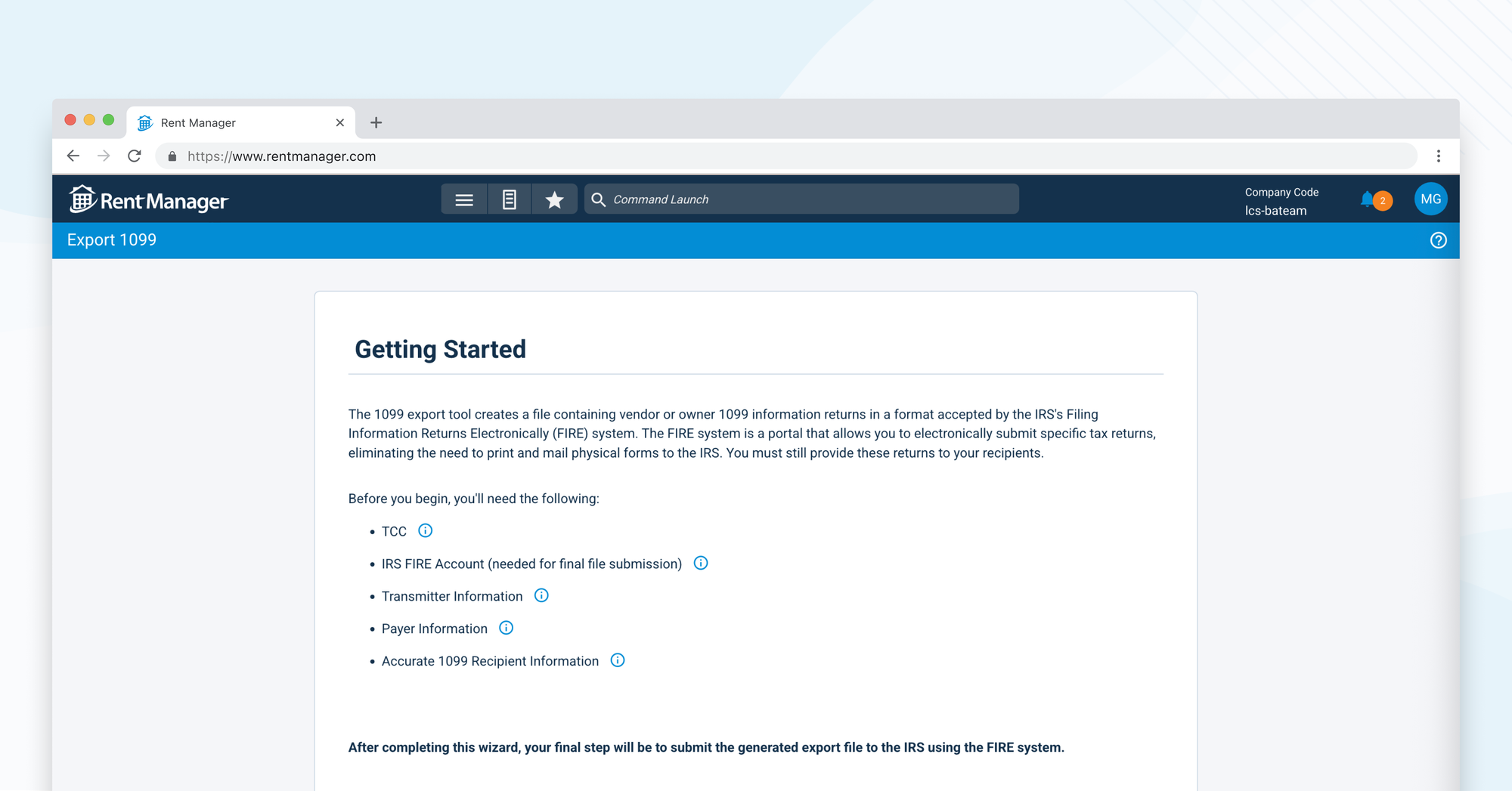
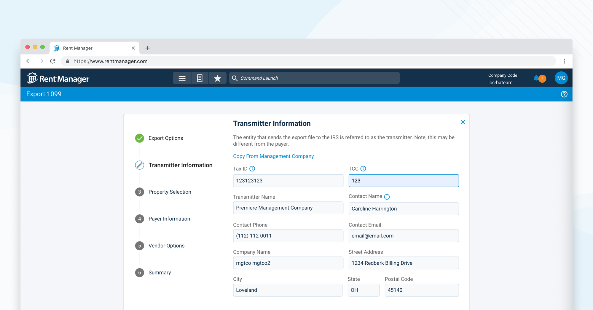
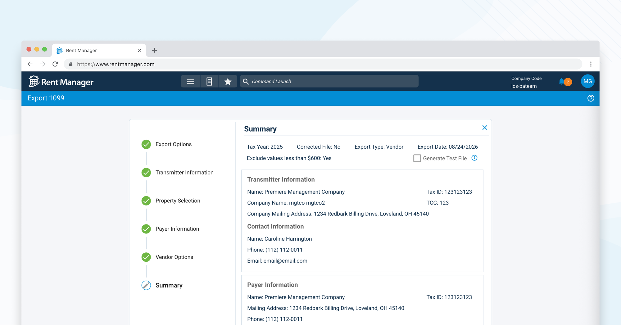
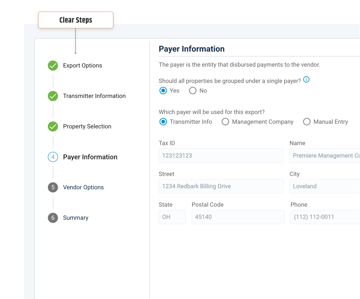
Solution: A guided, step-by-step export wizard that walks property managers through the 1099 filing.
 Shipped redesign in ~3 months
 Introduced guided workflows
 Improved user confidence

I owned the end-to-end design of the 1099 export experience, transforming a complex, single-page process into a guided sequence of focused steps.
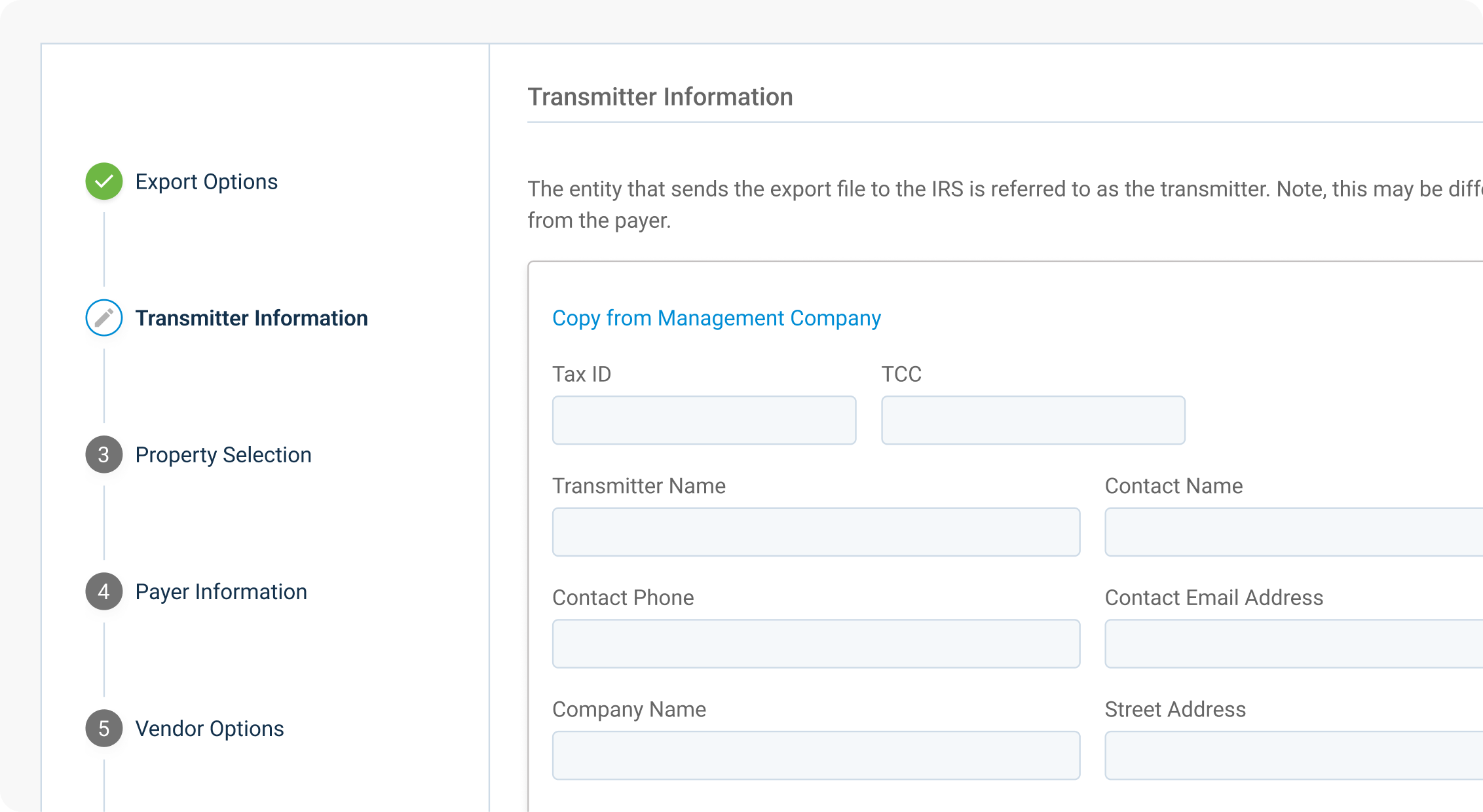

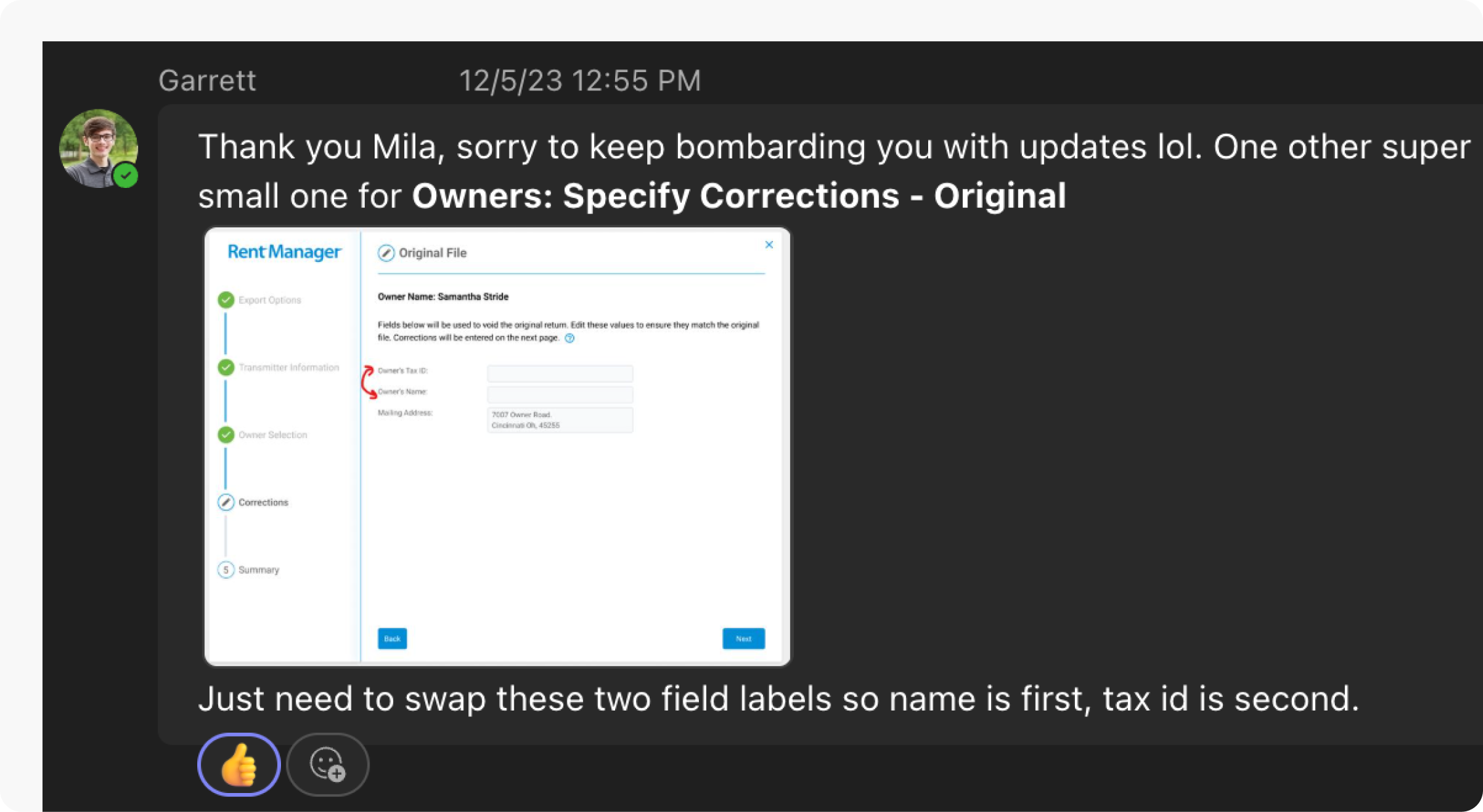
Partnered closely with Garrett to validate the workflow and ensure the final experience accurately reflected tax requirements.
How we identified the biggest sources of friction across users

IRS Filing Deadline
A hard external deadline required a rapid turnaround
Errors Had High Stakes
Incorrect tax filings could have big consequences later on
Meeting New Requirements
The new design should be integrated, not an add-on
Insights that informed our design decisions
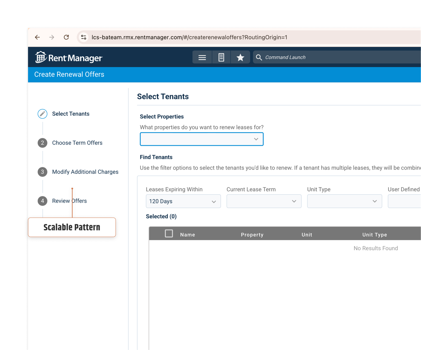
We used common sense! Due to the quick turnaround for this project we didn't have time to do any formal research. This is where designing for systems comes in, as we implemented the Walkthrough Wizard that I originally introduced as an onboarding flow in the previous Maintenance scheduling project.
Utilized existing components which saved precious time creating a custom solution
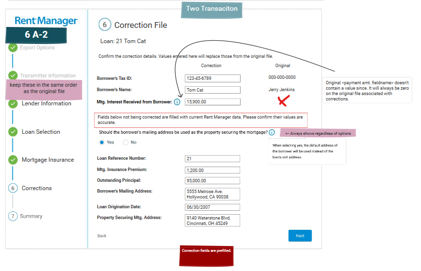
Correction files
Correction-file generation was separated into its own project rather than adding another workflow to the 1099 redesign. This kept the scope focused on improving the core export experience while allowing the new correction functionality to be addressed separately.
Exploring iterations and tradeoffs to reach a user centric solution
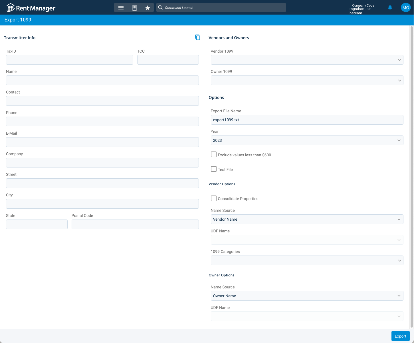
Before: 1 scrolling page with no guidance.
After: One set of decisions per screen, built-in validation along the way, and a final summary to review before anything gets submitted.
How the business and its users benefitted after launch
By designing for systems and not individual features, I was able to create scalable patterns that reduced development time and increased time to market
Designed and launched the new experience in under 3 months to support customers ahead of the IRS filing deadline.
Established a reusable pattern for breaking complex product experiences into focused, sequential steps.
Replaced a complex single-page workflow with guided steps that reduced cognitive load and made progress and requirements visible.
Hindsight is 20/20
To be honest, there isn't much of anything I'd change here, besides maybe having my devs stylize it closer to my original design! :)