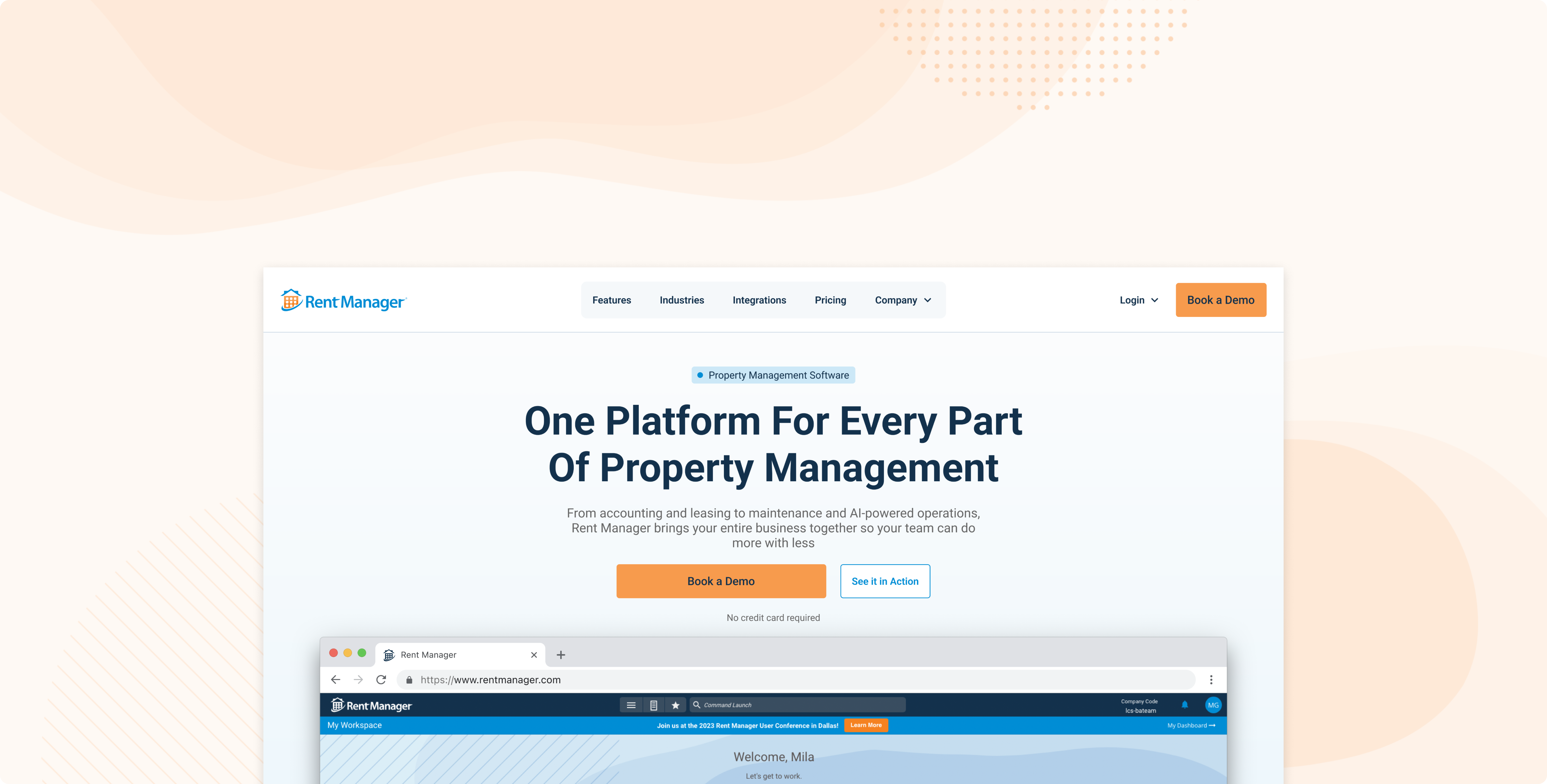
Rebuilding Rent Manager's website using a self-built Claude Code workflow
What was broken, why it needs to be fixed & who benefits once we do
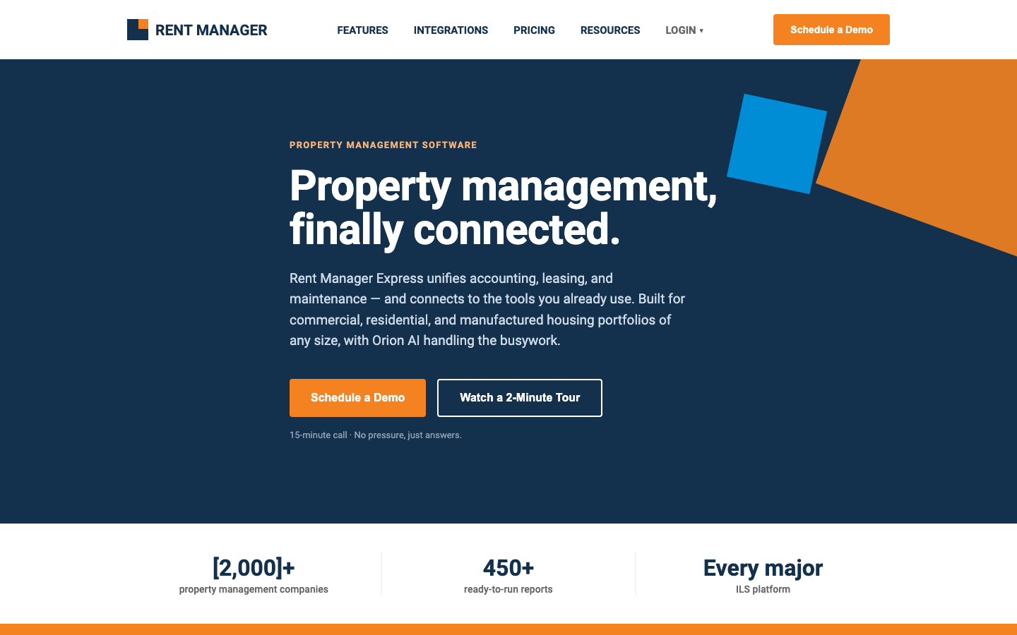
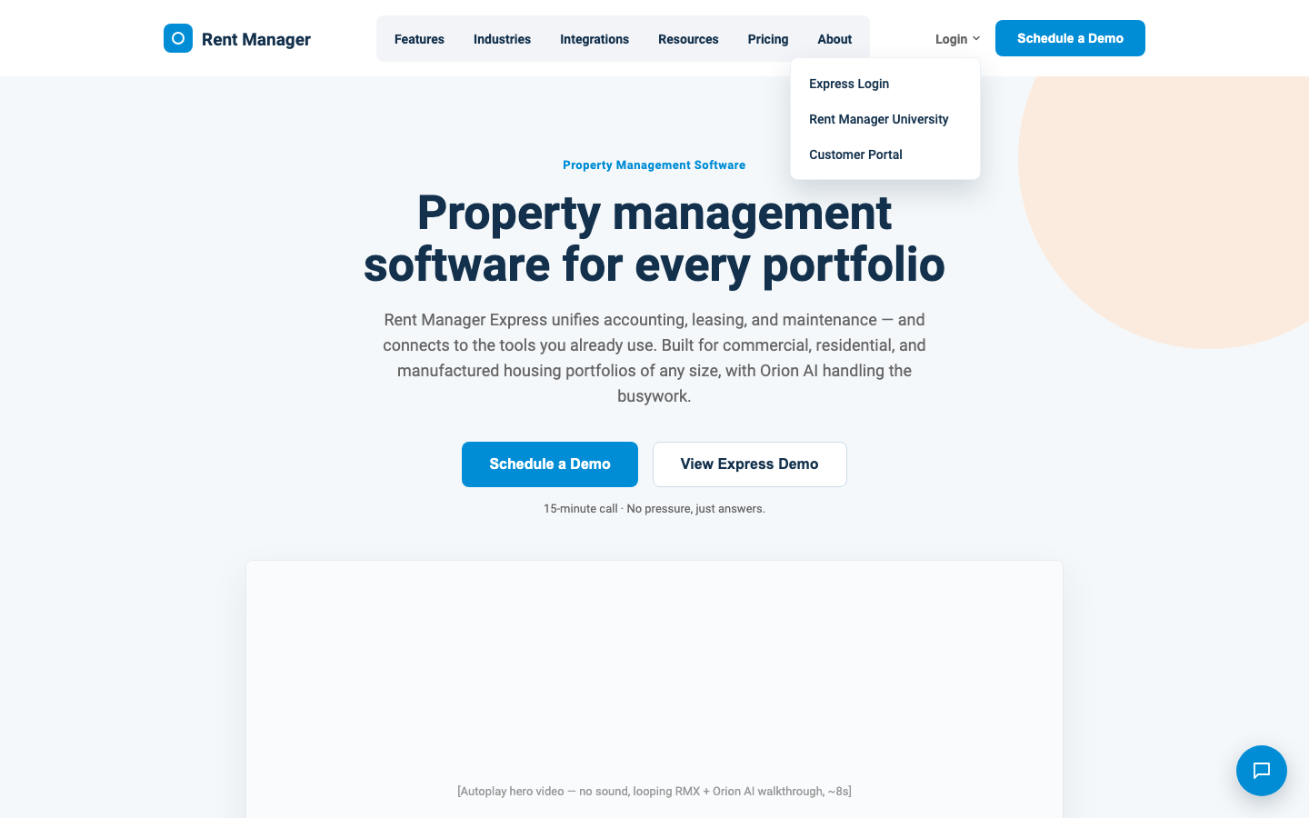
Rent Manager's marketing homepage undersold the product it was selling, and I set out to change that. I redesigned the homepage from scratch, and built an AI-directed workflow that could follow a set of design guidelines accurately for the pages that would come next.
A clean, modern homepage that highlights our MVP product
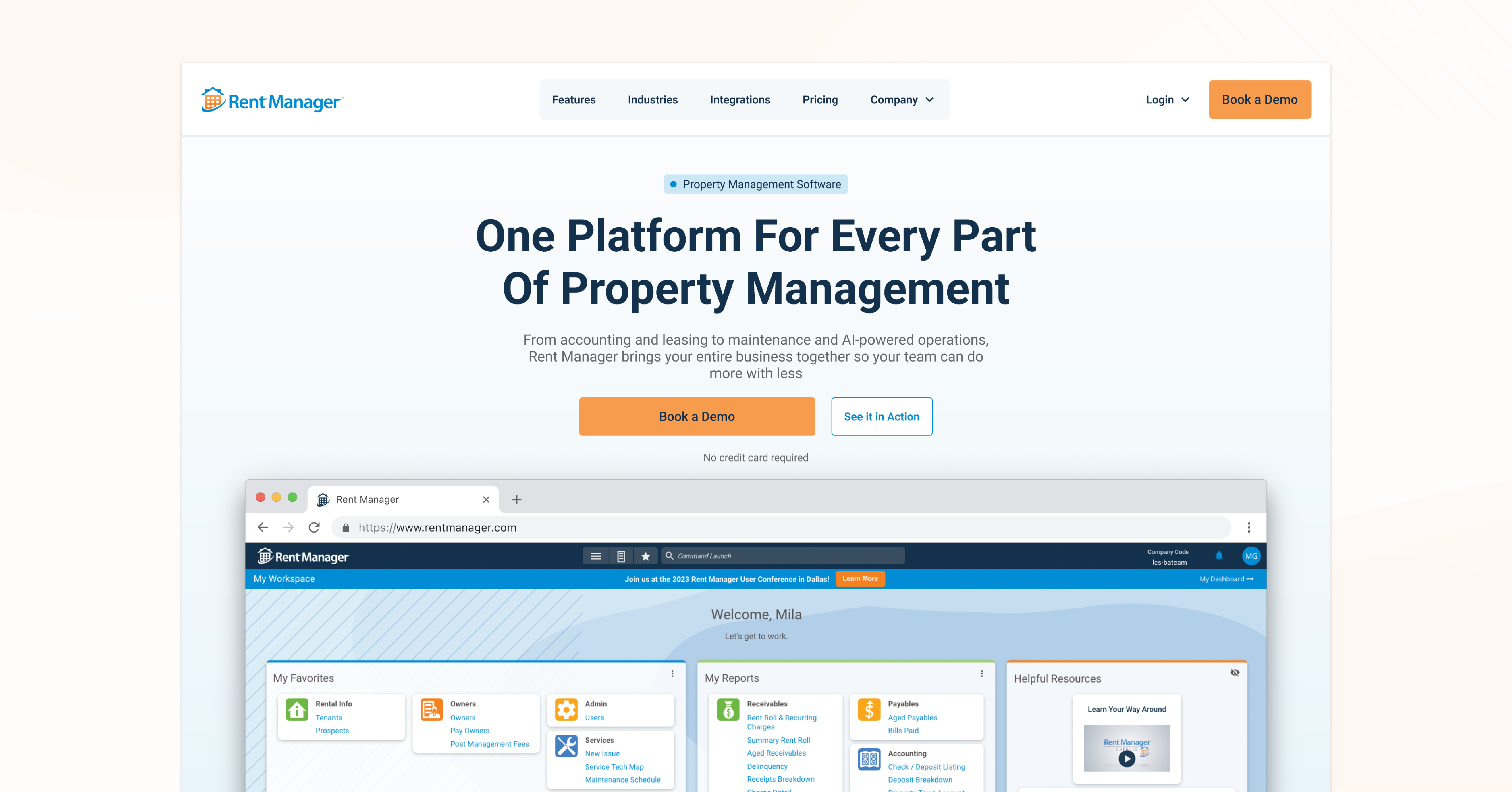
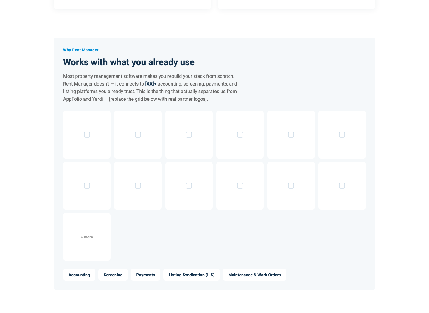
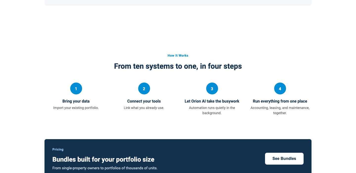

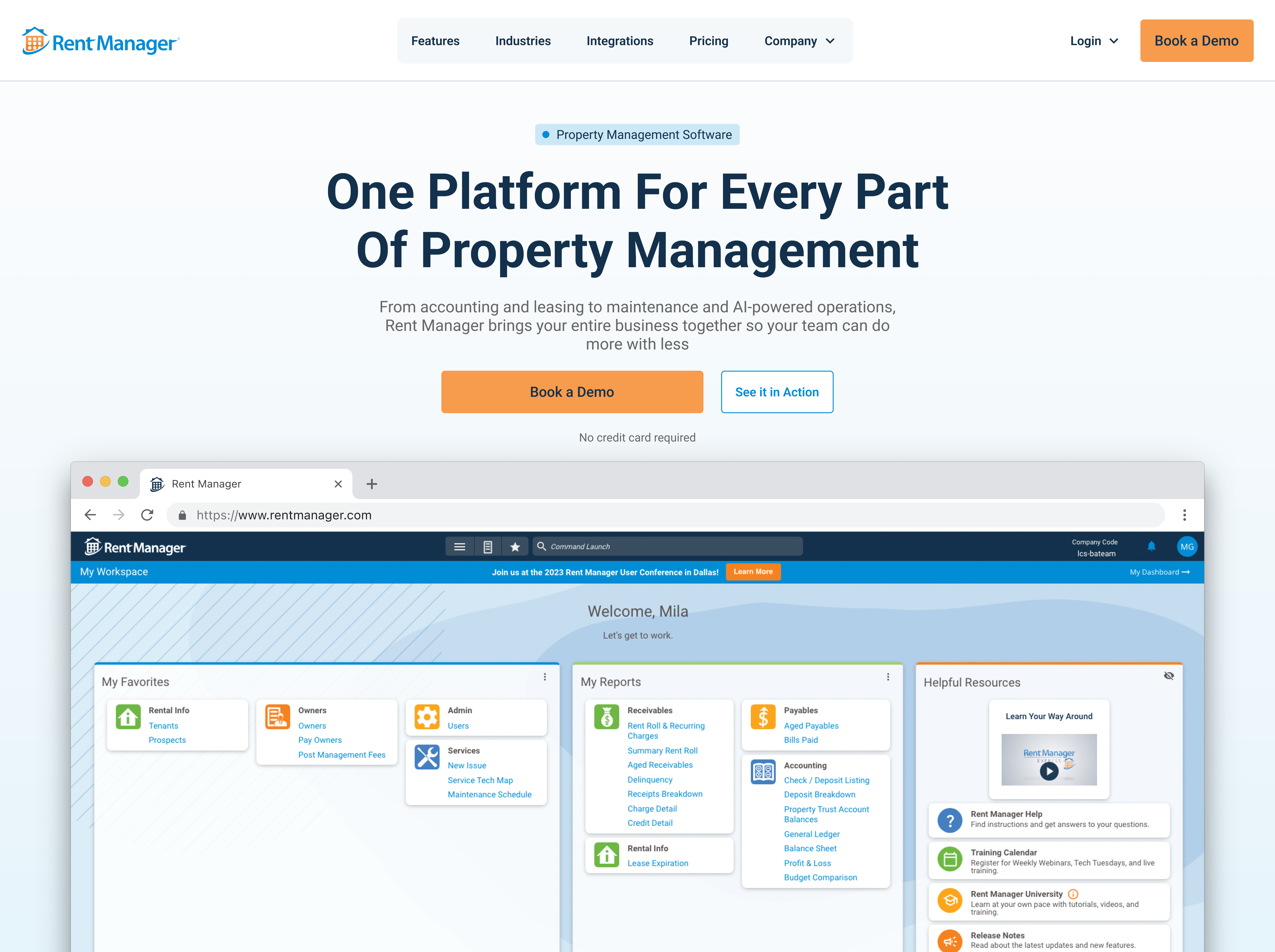
Solution: A clean modern, SaaS design built on our exisitng RMXDS Design system. I brought more focus to the acutal product we're selling and give users a preview without having to book a demo first.
 Built repeatable Claude skills
 Live interactive prototype
 Every real decision stayed human
How we identified the biggest sources of friction across users

AI-Generated ≠ Generic
The redesign needed to follow our existing design system, RMXDS
UI Infrastructure
Express runs on Angular, so it makes sense for the website to do so as well
Reusing Content
I wanted to reuse some of our existing text and assets where possible
Insights that informed our design decisions
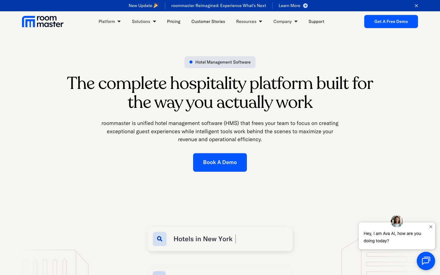
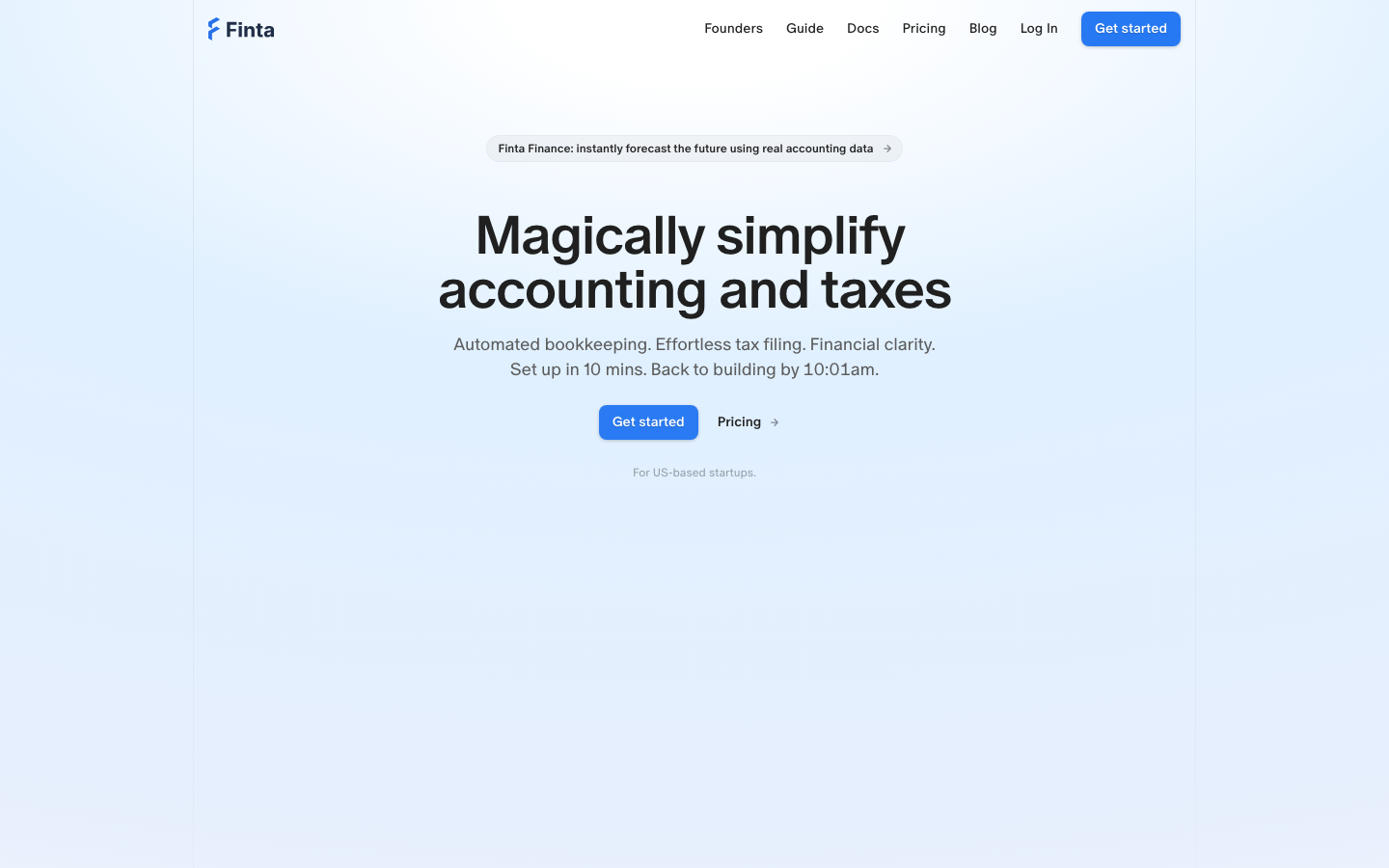
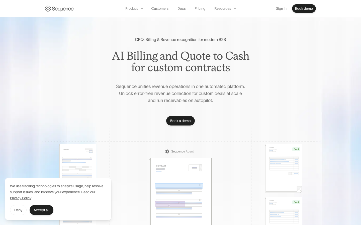
I used an AI critique tool (Roast My Website) to take an objective first pass at the live site's problems; I then browsed the real homepage myself (desktop and mobile) to confirm it against the direction our company is looking to go in for our MVP product. From there I found three adjacent SaaS websites for inspiration and leveraged Mobbin and Awwwards in my Claude skill to build concepts from common design patterns. I used a mix of:
AI Critique & Live Audit
Competitive Analysis
Dark mode
Dark-theme token values were pulled and recorded alongside the light palette, but never signed off. Rather than ship an unapproved theme, the redesign stays light-only until dark mode is explicitly reviewed and approved.
Exploring iterations and tradeoffs to reach a user centric solution
Claude provided me with 3 different concepts. One I cut immediately as it didn't fit the desired aesthetic, and the winning direction was a hybrid of the other two, plus some tweaks that I designed personally in Figma.
How the business and its users benefitted after launch
AI sped up the work, but direction, scope, and craft stayed mine, and the workflow I built makes that speed repeatable for the next page.
Encoded the whole pipeline into a reusable Claude Code skill: research, concepting, a Figma system, and a quality gate, built once and reusable for the next marketing page.
The Integrations page is a genuinely interactive prototype, not a static picture of a search box: real component state drives category and text-search filtering over one shared grid.

Six mismatched corner radii collapsed into one design-system value across all 11 artboards, verified with grep before publishing.
Hindsight is 20/20
I'd lock down real asset locations and a confirmed partner list before Figma work started. Several components are still carrying clearly-flagged placeholders that real assets would have avoided rebuilding around later.